Sometimes, it’s hard for CPA companies to figure out how to use technology? Is it hard to succeed in the rapid online market when your website looks outdated? The fact that your website is the entrance to your services, so solving the pain point is very important. But fear not-transformation is possible.
My guide covers practical tips and creative designs that will give you accountant website design inspiration. I’ll show you how a few changes can make your website a client-building powerhouse, from improving the user experience to making information more engaging. Let us start this journey with my 15 best accounting website design examples.
15 Accountant Website Examples in 2025 for Innovative CPA Firms
Are you concerned about building an astonishing accounting firm website? Take a peek at the best 15 CPA websites before designing your own!
1. Kinore Finance & Business Services

The top of the list of the best accountant website design inspiration is Kinore Finance & Business Services. Kinore’s web design is just wow! On the top of the website, they introduced themself in brief. Together, the call to action button, static menu bar, and transitional images with typography are available on Kinore’s website.
As orange symbolizes enthusiasm and happiness, they gave an orange touch to their website. Additionally, Kinore Finance & Business Services adds expertise, service, and commitment to the website, which helps gain credibility.
Need a classy accountant firm website design?
2. Bromhead
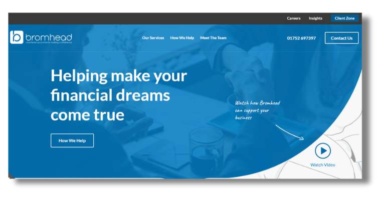
Are you looking for a professional but straightforward accountant website design example? A simple and professional one can be the key to establishing a business online. Bromhead is an excellent website design inspiration for CPA firms. It’s an attractive website color that can easily engage clients. The header has a simple background image and a creative video that creates excellent professionalism.
Furthermore, Bromhead used a sticky bar where menu contact and their logo are visible to get easy access to their other pages. The page is integrated with social media like LinkedIn, Twitter, and newsletters.
Hoping to find a sophisticated CPA website design with WordPress?
3. YPTC
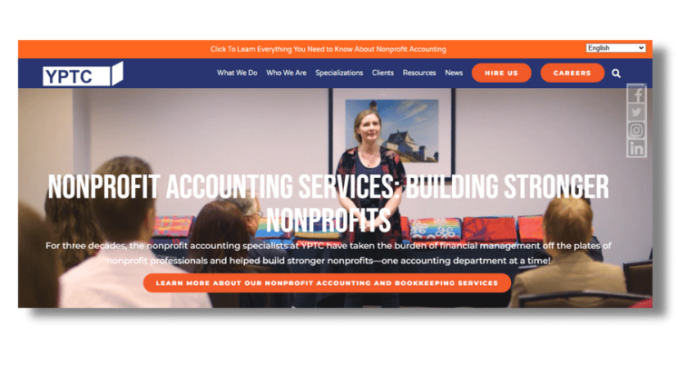
The following is the best example of an accountant’s website design YPTC. YPTC showed their company story with a video background heading and used a great company tagline, Typography. The color combination of the website is too good. Also, the white spaces throughout the website provide a great fair.
However, YPTC used excellent images and kept white spaces to make the website lucrative. In addition, the call-to-action buttons are in the sticky menu bar, which is also good.
Design your perfect accounting firm website.
4. Grant Thornton
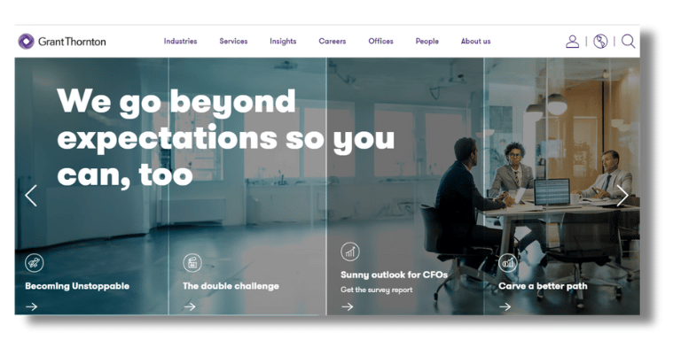
Another top accountant website design inspiration is Grant Thornton. When you need a realistic transition on your website and a slogan above that, then you must go to Grant Thornton. They used high-quality graphics on their website. Moreover, they used a large footer at the bottom of the website.
In the footer, they include social platforms Facebook, LinkedIn, Twitter, Instagram, and YouTube. Plus, there is a company introduction video at the bottom.
Are you in search of a sleek website design? Contact now!
5. Lutz

Continuing the list with the top accountant firm website design example is Lutz. It has an elegant appearance that displays the company’s services. The header has an uncomplicated menu bar, and the Lutz logo is positioned clearly for easy navigation. Green and white give a trustworthy look. In addition, clear and well-placed call-to-action buttons lead users to the steps you want them to take.
Another is that the website is split into different parts, each focusing on a different service, like Accounting, Consulting, and M&A. The service sections go into more detail about the services and include testimonials. The website is an excellent example of an expert CPA firm’s services.
6. Bench

Let’s examine yet another example of website design, Bench. The Bench website showcases the company’s financial services precisely with a sleek and accurate design. Ensure easy browsing with a simple menu bar and the Bench logo in the header. The blues and whites color strategy is formal and maintains reliability. The CTA buttons are easy to see and are in the proper place.
The website’s main features and benefits are highlighted within each part. Besides, the services include accurate human bookkeeping, one-on-one support, and robust financial reporting. The information is well-organized and straightforward to read along the website. In addition, the website provides various information and frequently asked questions, indicating Bench’s dedication to assisting small businesses.
Looking for a professional one like Bench? Here is the solution!
7. City Tax Accountants
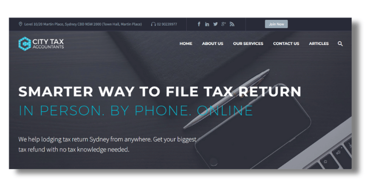
In addition, one of the best CPA website design inspirations is City Tax Accountants. The website of City Tax Accountants stands out by an elegant and functional layout that utilizes an eye-catching sky blue and white hue that expresses a sense of trust and reliability. An easy-to-find call-to-action (CTA) button for making an appointment is displayed on the homepage.
The top navigation menu is straightforward, which makes services, about us, and contact pages easy to navigate. The website also has a clean style and proper white space that grab visitors’ attention. The combination of aesthetic appeal and practical features makes the website incredibly simple.
8. Aliat
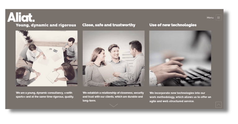
Need to see more CPA firm website design? According to a basic style, the Aliat Asesores website has a fresh, advanced look. The color pattern is mostly grayish, which makes the authentic look. They put the top menu bar to move between sections like “Services,” “About Us,” and “Contact Us.”
For a better user experience, the homepage has interactive parts and smooth scrolling transitions. In general, the design strikes a good mix between functionality and aesthetics.
9. Caroprese & Company
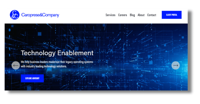
Let’s explore another top-notch accounting website design example. The Caroprese website has a neat and trendy look, with blue, black, and white tones. It has a simple primary interface with a precise menu bar at the top, making it simple to move between different parts. The smooth, effective transitions between pages make the user experience superior.
The website has, in a position, “call-to-action” (CTA) buttons, like “Schedule a Consultation,” Also, the interface is clean, and the elements, like service listings and contact information, are integrated.
10. Wilkins Miller

Another of the best examples of an accounting firm’s website is Wilkins Miller. The style of the Wilkins Miller website is very classy, with navy, green, and white color tactics that make it corporate. As you navigate the website, the top navigation bar smoothly directs you to critical parts, improving the experience with effortless transitions.
Engaging call-to-action buttons such as “Contact Us” encourage interaction and are strategically placed for the most significant effect. A combination of high-quality images with clean typography gives the web design an inviting and helpful look.
11. Moss Adam
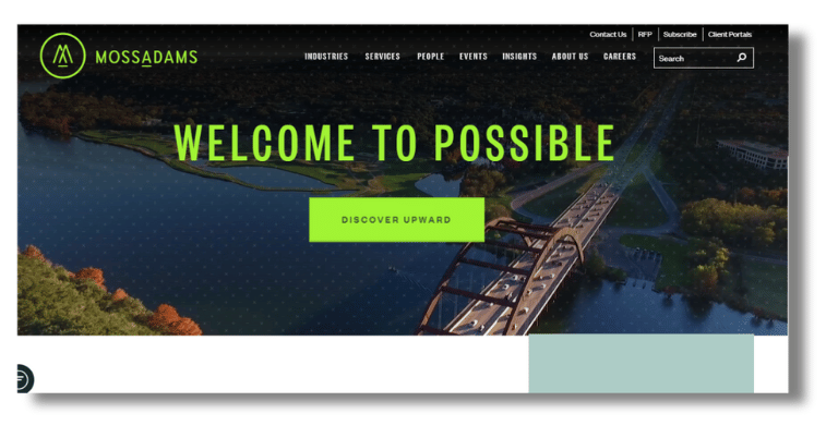
One of the most attractive CPA website designs is Moss Adam. Moss Adams’ sleek, modern website uses light green, grey, and white to represent expertise and class. The website has a sticky navigation bar containing careers, services, industries, and insights. The calls to action (CTAs) like “Contact Us” are not very lucrative. There are interactive elements on the homepage, like sliders and hover animations.
12. Avalon Accounting
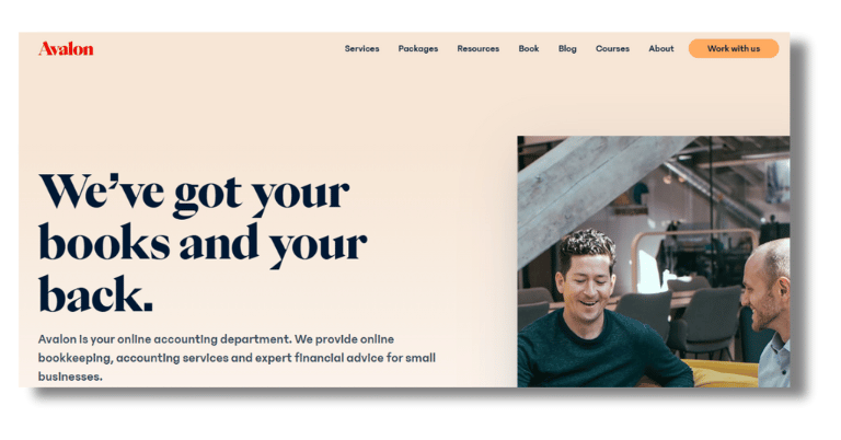
Want to look at the latest accounting website design example? The Avalon Accounting website beautifully guides users with the newest design. Blues and whites are calm colors that make the design look polished and trustworthy. Call-to-action buttons encourage users to take the next step, whether making a meeting or knowing more about the company’s services. Also, every website section expertly highlights a different service or feature.
Plus, testimonials from happy customers, free tools, and courses add a personal touch. Mainly, It is an excellent example of a professional services website that clearly explains the worth offering of the company.
13. Ingram Cole & Land Accountants
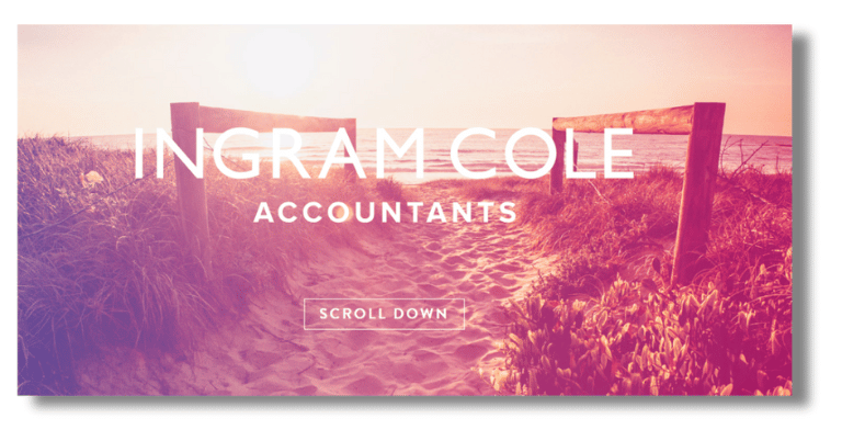
Let’s review another example of CPA website design. The Ingram Cole Accountants website is one of the best Accountant website design examples. Its clean and straightforward layout makes it easy for users to navigate. The calming blue and crisp white color palette conveys efficiency and confidence.
The website is well-structured, and each part highlights a different service or feature expertly. This makes it easy to find the information you need. There is a personal touch with happy customer testimonials, and Ingram Cole offers free tools.
14. RSM US
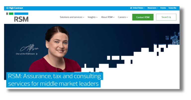
Another top-class CPA firm website design example is RSM US. The RSM US website uses a sophisticated design with shades of navy blue and soft gray for a business feel. A structured menu moves smoothly from one service or insight to the next, accompanied by clear, clickable “call to action” buttons that encourage further contact.
Although each part is different, they all fit together well, and the modern typography and balanced use of space make it easier to read and keep people interested. Blending these aspects so smoothly makes the user experience smooth and easy to understand.
15. The Green Leaf CPA
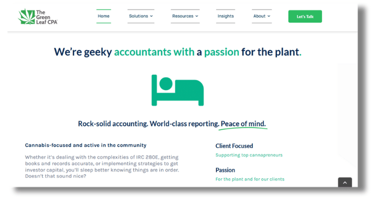
The final example of an accountant firm website design is in my list, The Green Leaf CPA. The website uses a fresh green and white color that matches the company’s cannabis-focused services. The website has an attractive, contemporary design and simple navigation, so users can quickly access different services with just a few clicks. The layout will feel smooth and easy to use as you move between pages. Also, the responsive design features stand out and make browsing more enjoyable.
Boundary-clearing buttons, like “Book a Strategy Session,” make it easy for users to take the next step. The visuals are specific to the business and appeal to the audience. Both thematically and practically, the design works well to keep people interested and show that the company is an accounting and tax advice expert.
What Makes a Good Accountant Website Design?
Many important design and functionality elements make an accountant’s website stand out. An efficient accountant website includes:
Strong Branding: The website should reflect your CPA firm’s branding, with colors, logos, and designs that match your professional image. As part of this, selecting the appropriate font and color is essential.
User-Friendly Navigation: A clear and sensible navigation setup is fundamental. As a result, your menu bar will be well-organized, with parts for services, “About Us,” team profiles, and contact information will be marked. Dropdown menus help provide a straightforward interface for more complex services.
Professional Design: Professional colors, like blue, gray, and white, should create a clean and trendy look. These colors help to feel calm and reliable. The style should be clean and have lots of white space to make it easier to read.
Responsive Design: Ensure the website works well on all devices, especially phones and tablets. Also, build a flexible design when the screen size changes; a flexible design shifts without any problems.
Effective Call-to-Action (CTA): It’s best to have clear, easy-to-find CTA buttons like “Book a Consultation” or “Get in Touch.” These encourage deeper service engagement.
SEO Optimization: Use relevant terms, meta tags, and descriptions on your website to make it more visible to search engines and get more free traffic. Without doing SEO for an Accountant website you can’t hope to rank on Google.
Client Testimonials and Case Studies: By displaying your expertise and appreciation of your clients, testimonials and case studies are great ways to build credibility and trust.
Regular Content Updates: Freshen up your site’s content with helpful blog posts, tax tips, financial planning advice, and the newest news in your business regularly.
Contact Information: Make it easy for people to contact you by putting your contact information on every page and adding a contact form.
Conclusion
Before we go, remember that your website is more than just a digital brochure. It’s the way people find out about your CPA firm and the services you offer. The best 15 accountant website design inspiring examples show the best ways to do things and how your website can be a powerful tool for getting people to visit and stay on it.
Follow the above tips, add your company’s individuality, and you’ll have an engaging online presence that connects with your audience and stands out. Ready to change how your website looks? Come on, let’s make it memorable!
To get the best Accountant Website Design, Contact Us!
Also Read

